A Brand System Built to Scale With the Business
Sydney Consulting Group had a logo, a color palette, and a typeface, each used a little differently every time. No documented voice, no shared templates, nothing a team could execute against without design in the room. This case study covers the identity system, template set, and formalized voice guide built to close that gap, done alongside a full-time role, not as a dedicated project.
The Arc
The Opportunity
Real brand elements. No shared system. Every touchpoint built from scratch.
The Work
Identity system, templates, voice guide, refreshed site. Built to be used without a designer in the room.
The Shift
One brand, one system. Templates and a voice guide the team can execute against directly.
The Opportunity
The pieces existed. The system didn't.
Sydney Consulting Group already had a logo, a color palette, and a typeface. What it didn't have was consistency. Each new deck, document, or post pulled those pieces together a little differently depending on who built it and what tool they had open. There was no documented brand voice, so tone shifted from one piece of content to the next. There was no template system, so every deliverable started from a blank page instead of a foundation.
This wasn't a rebrand. The identity itself was sound, it just hadn't been formalized into something repeatable. The ask was to take what already existed conceptually and turn it into an actual system: a documented identity, a working set of templates, and a voice guide specific enough that someone other than me could check content against it. All of this alongside the day-to-day design and marketing strategy work at SCG, not as a standalone project with its own timeline.
The Work — Identity System
Documenting the foundation first
Before building anything new, the existing logo, color palette, and typography got a consistency pass, confirming final versions and documenting the actual values (hex/RGB, typefaces) instead of leaving them to memory or whatever file someone had saved locally. That documentation becomes the one-page brand guide below: the logo lockup, the confirmed five-color palette, the Recoleta and Lato type pairing, and the brand's core message and tone, all on a single reference anyone on the team can pull up instead of guessing.
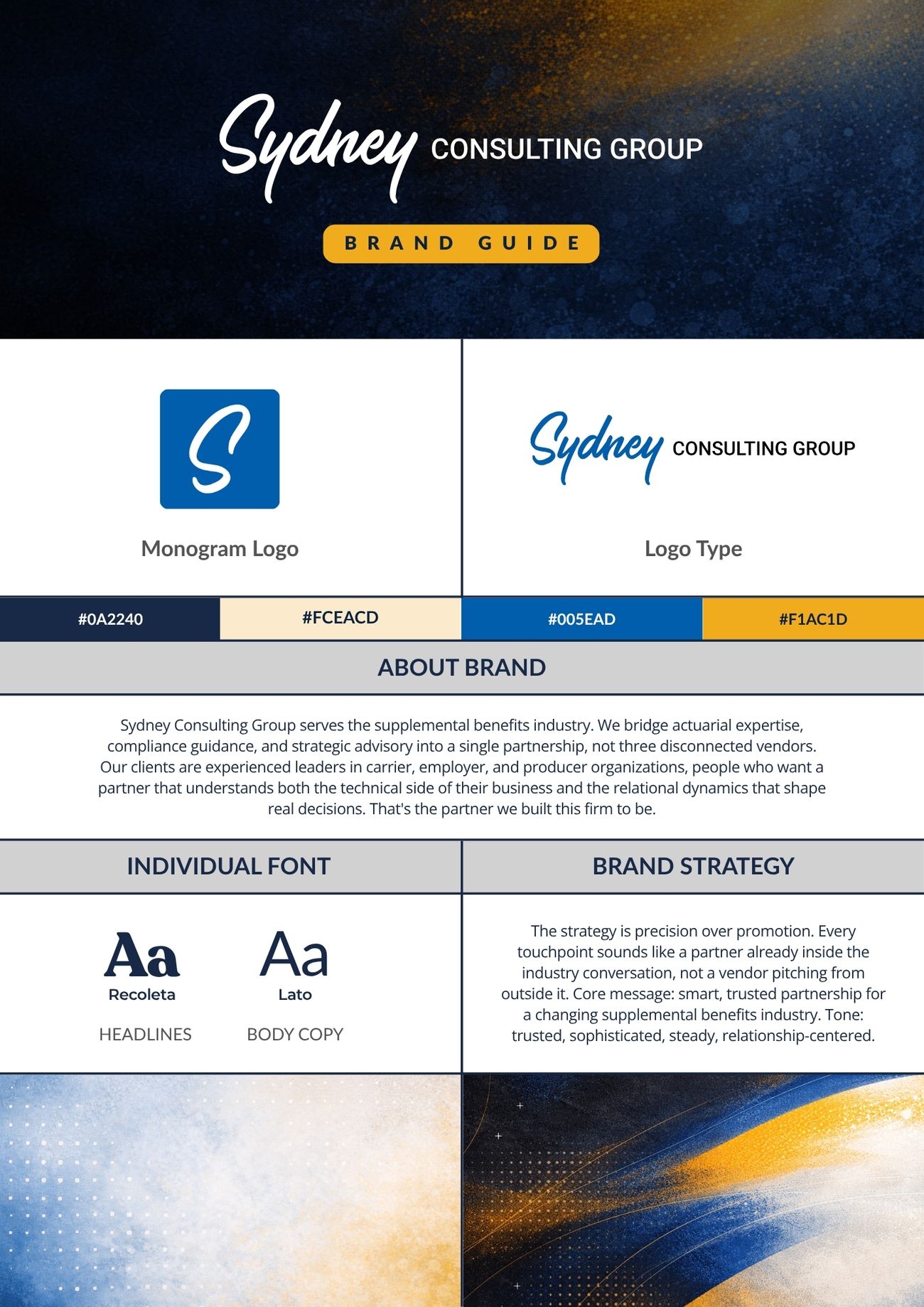
One-page brand guide. Logo lockup, five-color palette, typography, and the documented brand strategy, condensed into a single reference the team can check any deliverable against.
The Work — Applied System
The system in daily use
A brand guide that sits in a folder doesn't change how work gets made. The templates are where the identity system actually gets used: a deck/presentation template and a letterhead and document template, both built against the documented identity system rather than reinvented per deliverable.
Company Overview Deck, page-transition preview. Navy/gold identity system applied across a full deck, built to navigate like a website.
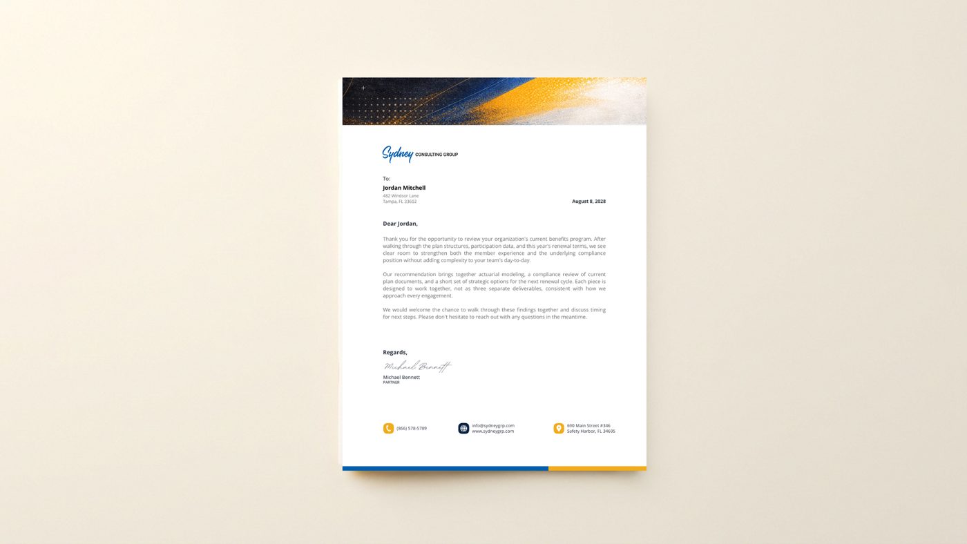
Letterhead template. Click to see the full page detail.
The Work — Voice
Giving the brand a documented voice
The voice itself already existed conceptually, distilled in an earlier internal brand vibe report but never turned into something usable day-to-day. Formalizing it meant reworking that report into a working reference: voice attributes with do/don't guidance, tone differences across channels (website vs. social vs. email vs. media appearances), and before/after examples showing the voice in practice. The goal wasn't to invent a new voice, it was to make the existing one checkable, so a teammate can hold new content to the same standard without re-reading a mood board every time.
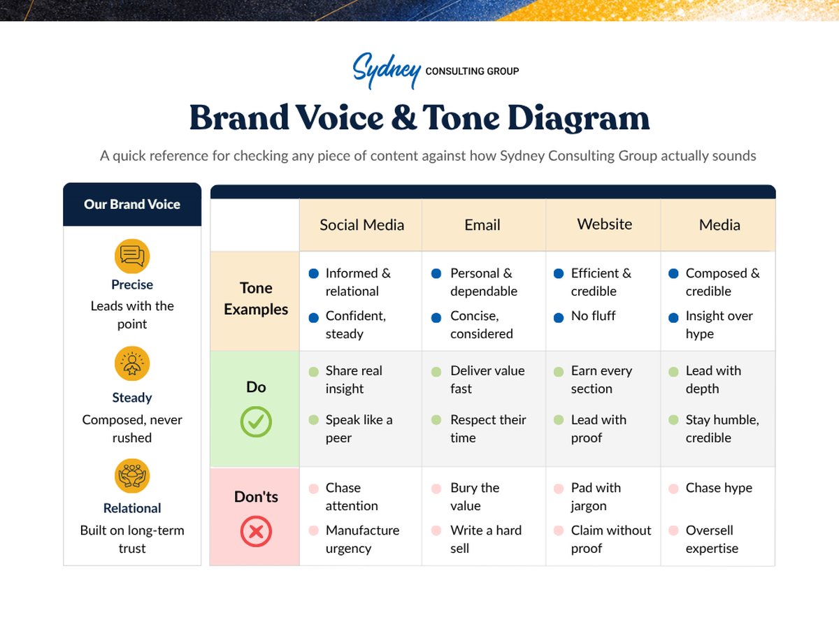
Brand Voice & Tone Diagram. Core voice attributes and channel-by-channel do/don't guidance, condensed into a quick reference anyone can check content against.
The Work — Website & Social
The system, live
The identity and voice system isn't theoretical, it's already shipping. The refreshed site is built and moving through staging and UAT. A set of LinkedIn posts written against the same voice guide gives an early look at how the system reads in the wild, on the channel where SCG's audience of carrier, employer, and producer leaders is most active.
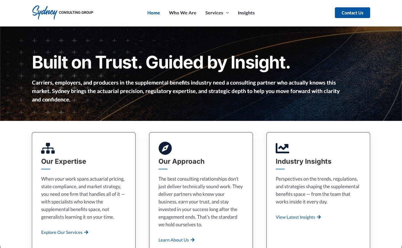
Homepage. Navy/gold identity system applied to the hero and full page.
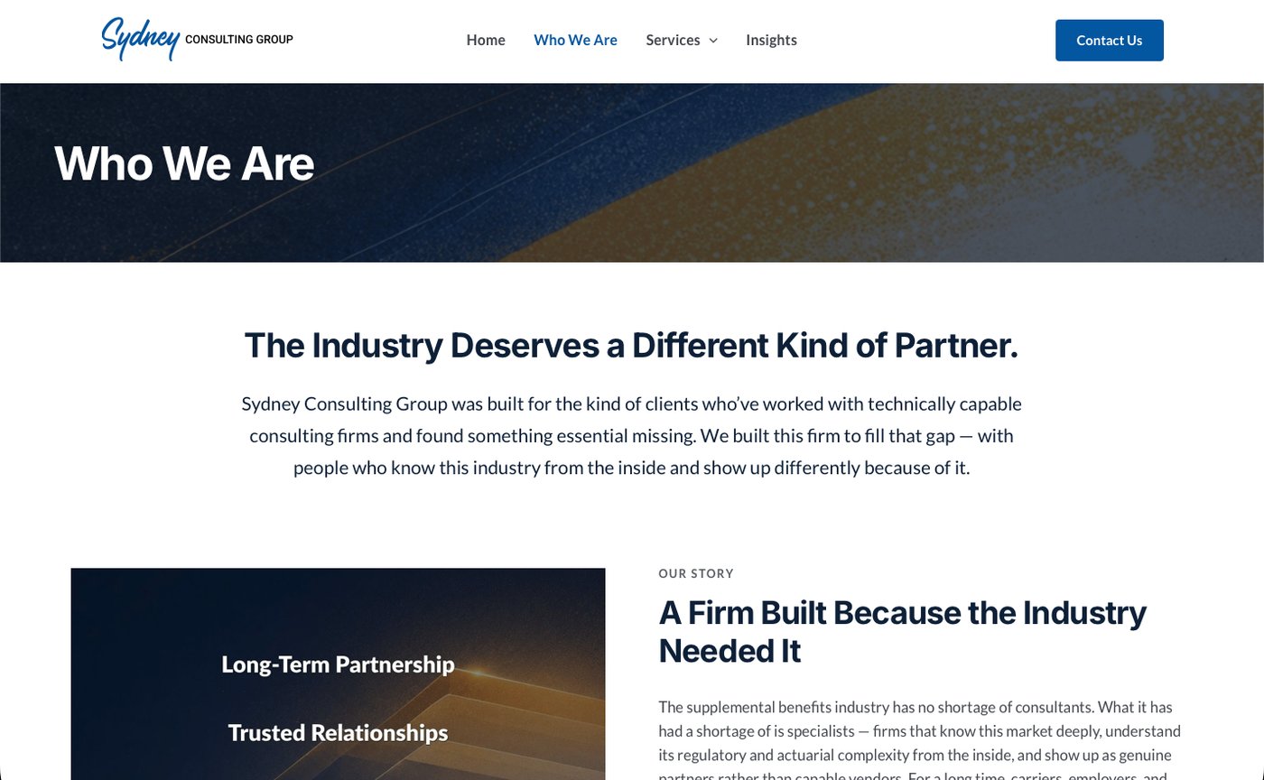
Who We Are. The same identity system carried consistently into interior pages.
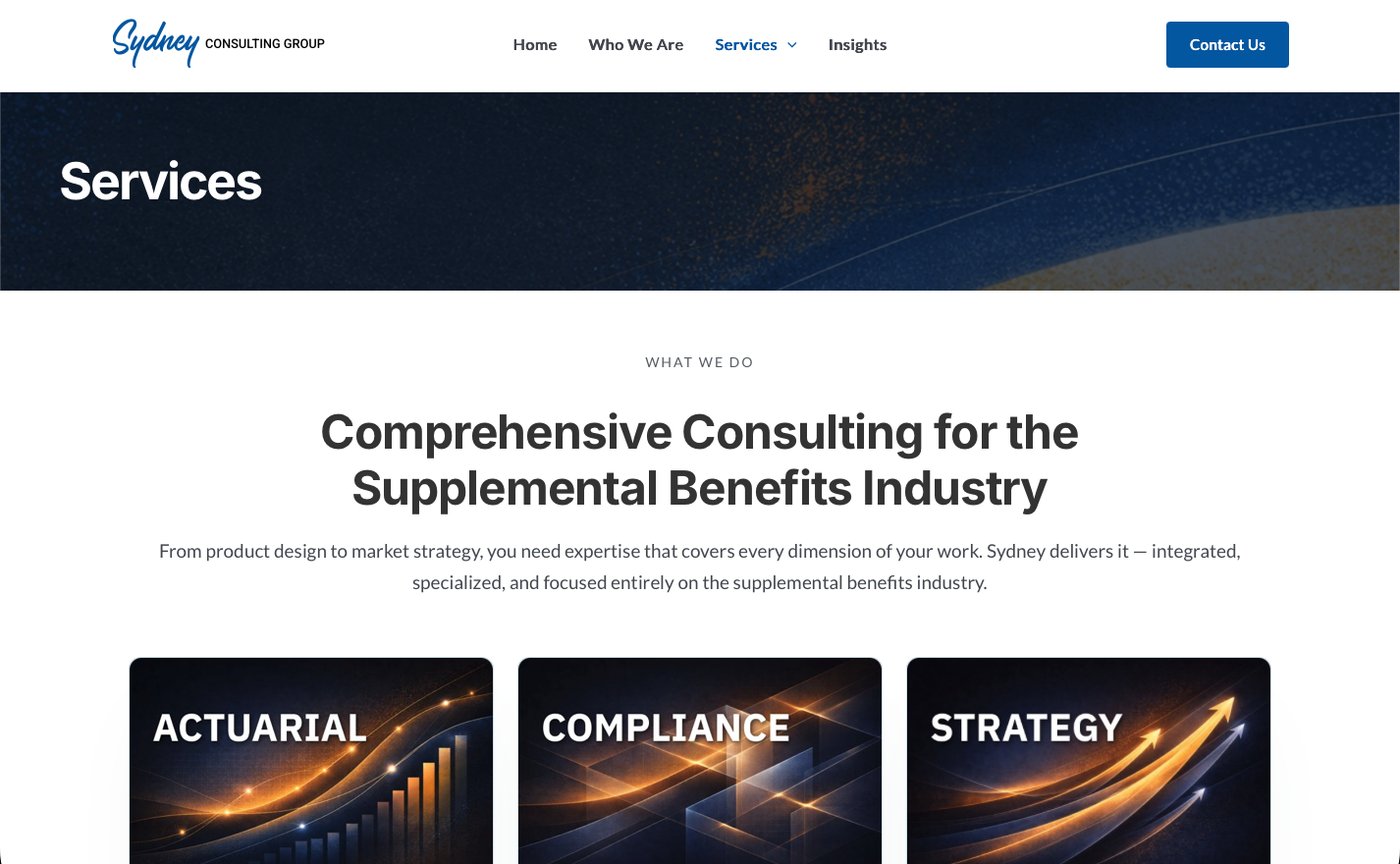
Services. Actuarial, compliance, and strategy, presented as one integrated practice, not three separate offerings.
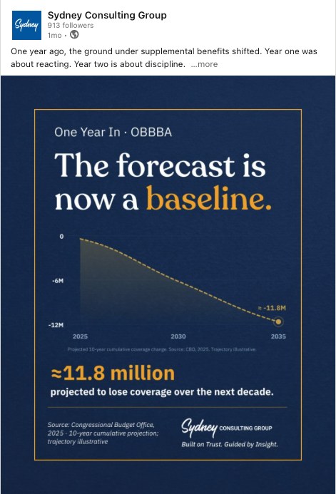
Data-led post on coverage projections, navy/gold graphic treatment.
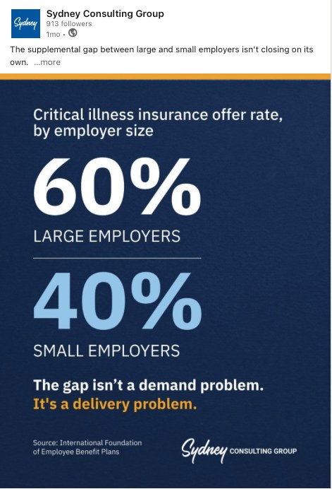
Industry stat post, same visual system applied to a comparison graphic.
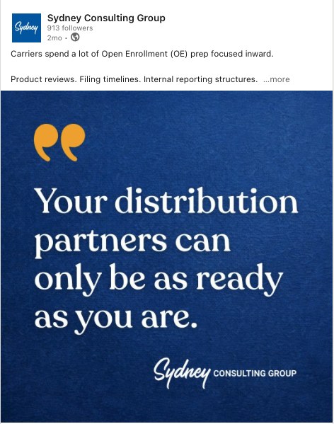
Quote-style post, the same voice and identity system carried into a simpler graphic format.
The Shift
One brand, one system, one place to check it
The identity system, template set, and voice guide now live in one place instead of scattered across whoever built the last deck. New content gets built against a documented standard, not recreated from memory. That's a small operational shift with a compounding effect: less time spent rebuilding brand basics per deliverable, more consistency across every touchpoint a prospect or partner actually sees.
5
Documented voice attributes, each with explicit do/don't guidance
4
Brand assets built from one documented system
1
Single source of truth, replacing scattered decks and memory